
Lead Product Designer • 2020 - 2023
The Centers for Medicare & Medicaid Enterprise Tracking System: MedTrak
MedTrak is a secure internal web application built for the Centers for Medicare & Medicaid Services (CMS) to manage medical record abstraction, data validation, and quality control for national healthcare programs.
Legacy to Web-based Modernization

Enhanced Usability with Modals

A New Provider Search Component
A streamlined, always-accessible search experience that also allows for filtering now makes it effortless to locate both active and inactive providers with clarity and speed.
Results: 568 providers
Search by name, code, or state
Filter:
Active only
Project Overview
My Role
Lead Product Designer
Team
Agile team including client stakeholders, admin users, and developers
Platform
Internal custom web application
Tools
Sketch, Visual Studio Code, Jira, Blazor UI (Telerik components)
Timeline
~ 2 year
Goal
Modernize a 20-year-old legacy desktop system into a responsive, cloud-based platform. The project focused on redesigning the dashboard and key modules for MedTrak, streamlining the quarterly abstractor review process, reducing friction in daily workflows, and improving usability through thoughtful information architecture, clean visual design, and integrated UI components.
Challenge: Transform a Legacy Desktop Application into a Responsive Cloud Platform
The MedTrak modernization presented three fundamental challenges:
Preserving Familiarity: Users were accustomed to a multi-window desktop workflow. We needed to modernize without creating disruption.
Navigational Overload: The legacy system had 32 undifferentiated menu items, creating a steep learning curve for new abstractors.
Cultural Shift: Developers had never worked with a dedicated UX designer. I needed to introduce user-centric thinking alongside the technical migration.
The Approach: Discovery, Iteration, and Validation
Setting Goals and Building a Foundation
Discovery & Research:
I began by interviewing stakeholders and abstractors to uncover primary goals and pain points. A top priority was boosting efficiency. Abstractors spent too much time hunting through multiple windows and relying on external tools like Crystal Reports.
Mapping the Legacy System:
I audited and mapped all existing modules, capturing the core workflows to inform the structure of the new platform’s global navigation.
Wireframing & Prototyping:
Using Sketch and Blazor UI libraries, I produced low-fidelity wireframes and interactive prototypes, focusing on validating early ideas quickly with the users and developers.
Design System & Master Template:
I built a flexible master template using Telerik Blazor components, enabling developers (with minimal CSS/HTML experience) to rapidly plug in standardized layouts and focus on backend logic.
Agile Collaboration:
I established a dedicated Jira board for the UI/UX track and stayed at least one sprint ahead of development. Assets, mockups, templates, user stories, and design notes were organized in a shared GitHub repo to keep the team aligned.
Visual Design
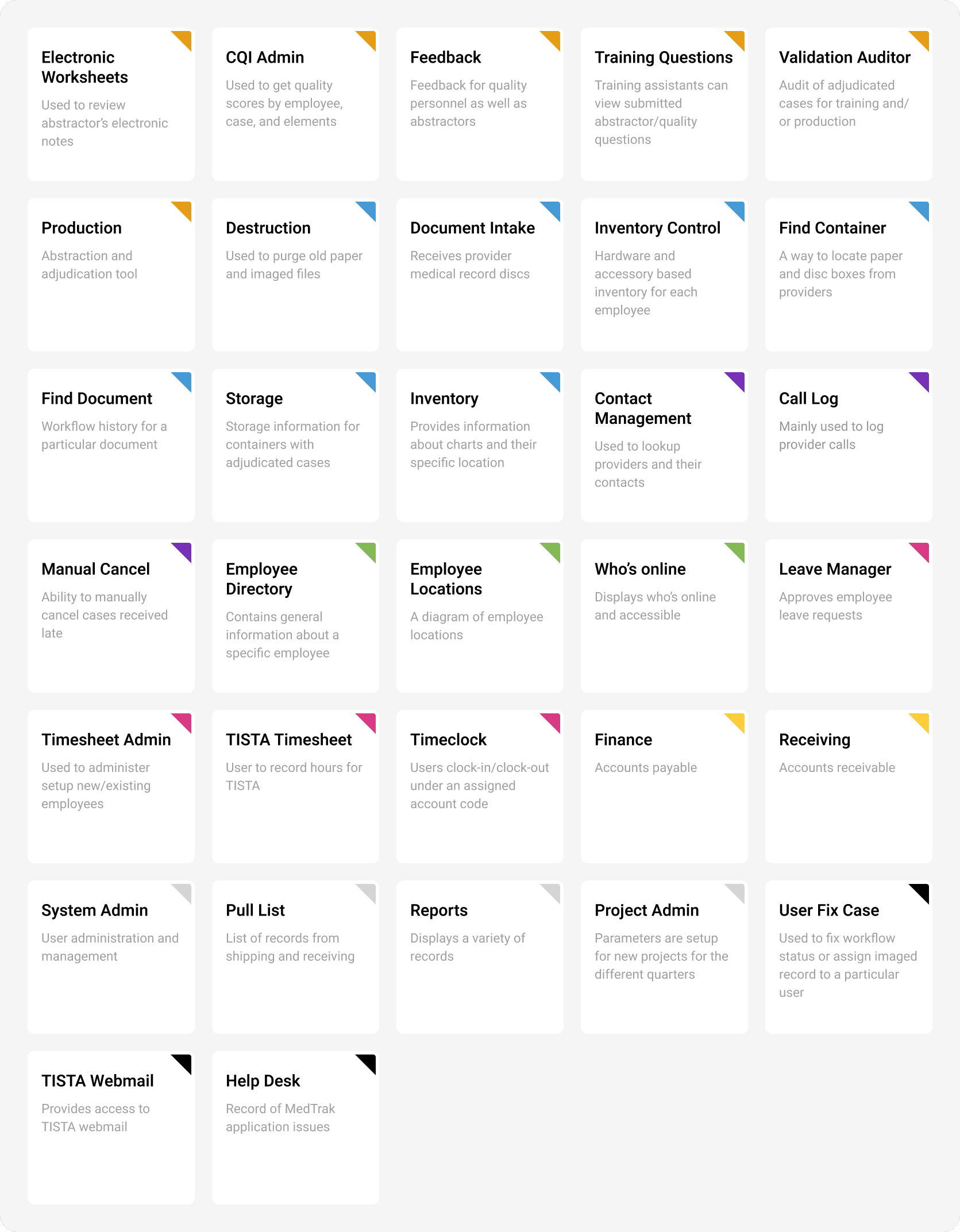
Redesigning Navigation for a Legacy Desktop Application
The original application presented a major usability challenge, with a flat navigation structure containing 32 undifferentiated menu items and no sub-navigation. This created a steep learning curve for new users, and even experienced abstractors were unsure of the purpose of many menu options. Improving the navigation became my first priority.
I began by collaborating with the lead abstractor to define clear, concise descriptions for each menu item. With that foundation, we introduced a color-coded system to visually group related items. These groupings were then validated through a card-sorting exercise involving the broader team, allowing us to define intuitive category names and introduce a streamlined sub-navigation structure.
The redesigned navigation significantly improved usability and was enthusiastically received by abstractors. We also implemented role-based visibility, ensuring users only saw the menu items relevant to their permissions—further reducing cognitive load and improving focus.
Redesigning the Provider Contact Management Experience
Given the system’s complexity, I focused on the Provider Contact Management section—applying the same UX strategy across other modules. This section centered around a one-to-many relationship: a list of providers, each with multiple associated contacts holding different roles. The original interface lacked clarity and was difficult to navigate, making it challenging even to identify the appropriate starting point.
To gain a clearer understanding, I interviewed a senior abstractor who walked me through the typical user flow. I documented the experience, highlighting key pain points around filtering providers and managing contact details.
With those insights, I began an iterative design process—starting with low-fidelity sketches and screen shares to gather early feedback. This collaborative approach helped ensure user alignment before I moved into high-fidelity wireframes. While original screenshots of the legacy UI weren’t available, I recreated a wireframe based on my notes and sketches to illustrate the previous state and guide design improvements.

Balancing Visibility and Usability in Provider Contact Management
While uncovering user pain points, one theme became clear: abstractors valued visibility over minimalism. They preferred having key UI elements clearly displayed—even at the cost of a cleaner interface. This insight directly influenced the wireframe design.
Given their fast-paced workflow and frequent screen switching, hiding infrequently used controls led to unnecessary delays and frustration. I designed an interface that prioritized quick access to essential actions while thoughtfully organizing the layout to avoid visual clutter. The result was a balanced UI that respected user preferences and improved task efficiency without overwhelming the screen.
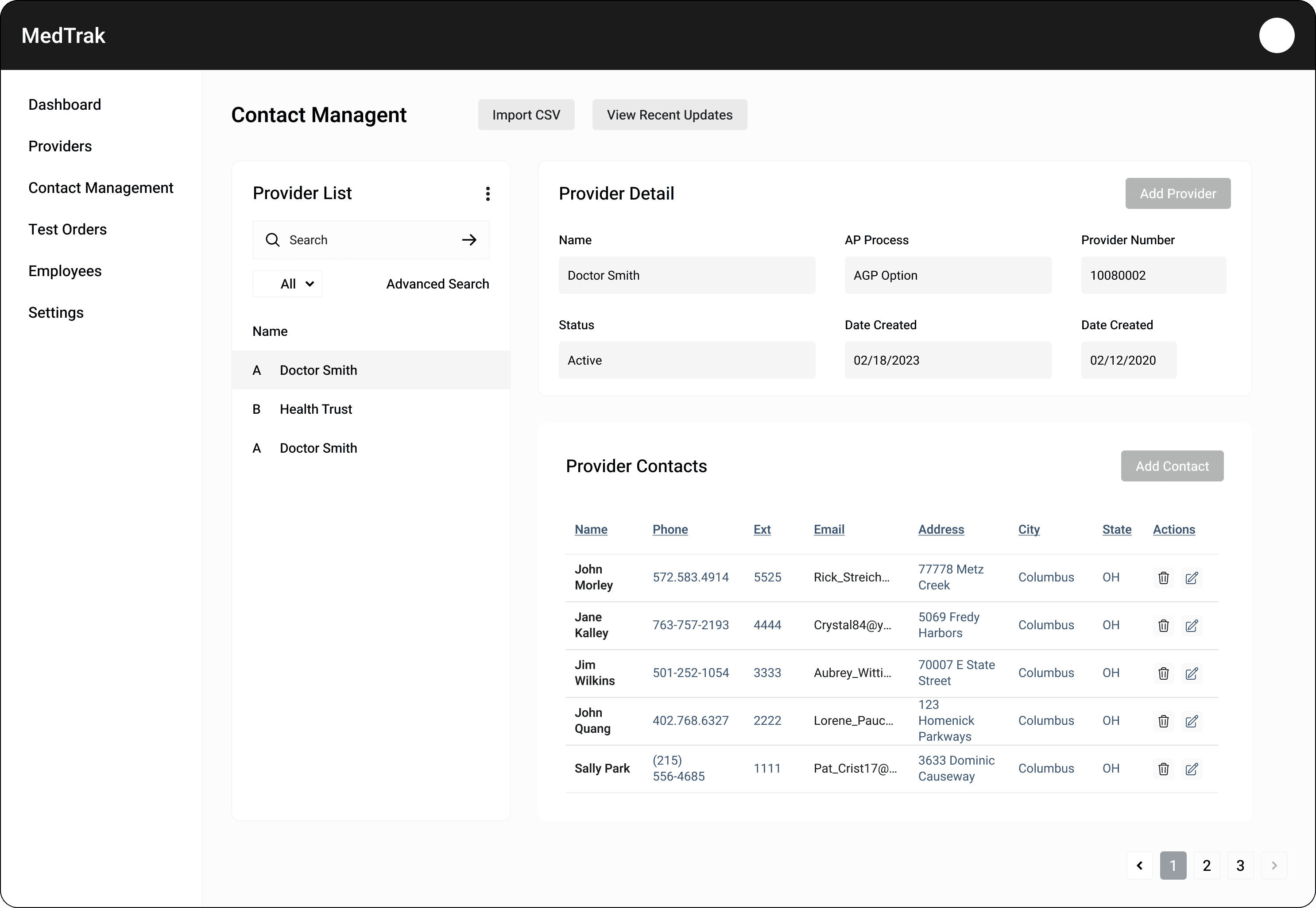
Streamlining Provider & Contact Management in the Web-Based Redesign
The redesigned interface was a major success with users, who found the new layout far more intuitive and efficient. Managing providers and their associated contacts became significantly easier, thanks to a streamlined structure and clearer visual hierarchy.
One key improvement was replacing the legacy system’s cryptic status codes with plain-language labels like Active and Inactive—a necessary and welcome shift as we transitioned from a desktop-based system to a modern web application. Additionally, the old application relied heavily on pop-up windows, including a separate advanced search window. In the new design, most of these interactions were elevated into the main layout for better visibility and flow. Pop-ups were reserved exclusively for key tasks like adding or editing provider details, now handled through clean, focused modal windows.


User Feedback and Testing
Post-launch, abstractors reported a significant reduction in daily frustration. The redesigned navigation eliminated the need for external 'cheat sheets' that many had printed and kept at their desks. The new provider search component was adopted immediately—users no longer relied on alternative tools like Crystal Reports to find critical data.
Outcomes
Metric
Improvement
Provider Search Time
Reduced from minutes to under 30 seconds
Onboarding Time
Reduced from 4-6 weeks to 2-3 weeks
Support Tickets
Noticeable reduction in navigation-related tickets
External Tool Reliance
Eliminated use of Crystal Reports for core tasks
Reflection
The MedTrak project reinforced a critical lesson: legacy modernization is as much about managing human behavior as it is about rewriting code. Users had built their entire workflow around the quirks of the old system. My success depended not on creating the 'perfect' interface, but on identifying which legacy behaviors to preserve and which to gently evolve. This balance—between familiarity and innovation—became the guiding principle for every design decision.
Note: Due to CMS confidentiality requirements, I am unable to share specific visual assets from this engagement. The screen flows, wireframes, and UI components shown here are representative of the design work delivered and are shared with permission in a redacted format.