
Lead Product Designer • 2017-2018
ODS Grants Efficiency Management System (GEMS)
The Office of Dietary Supplements at the NIH was managing a multimillion-dollar quarterly grant portfolio through a legacy system that was slowing down critical funding decisions. I led the UX redesign of the GEMS platform to reduce reviewer friction, accelerate the review cycle, and ultimately speed the funding of dietary supplement research.
Real-Time Insights with GEMS Dashboard
Users can now stay on top of grant activity with real-time insights, clear visuals, and shared access that streamlines collaboration and decision-making.

Internal Messaging
This is a great program!
1 day ago
Seamless Collaboration
You can now monitor where other users are in each step of the grant review process. Users work more efficiently by centralizing how they communicate.




Project Overview
My Role
Lead Product Designer
Team
Agile team (client stakeholders, admin users, devs)
Platform
Internal custom web application
Tools
Atom, Sketch
Timeline
~1 year
Goal
Modernize the legacy dashboard and review form for the ODS GEMS platform, streamline the quarterly review workflow, and improve usability through visual and functional enhancements.
Challenge: Create a Centralized, Modern Grant Monitoring System
The Office of Dietary Supplements (ODS) needed a comprehensive and modern solution to monitor the grant review process from start to finish. The legacy system was inefficient and poorly designed for usability:
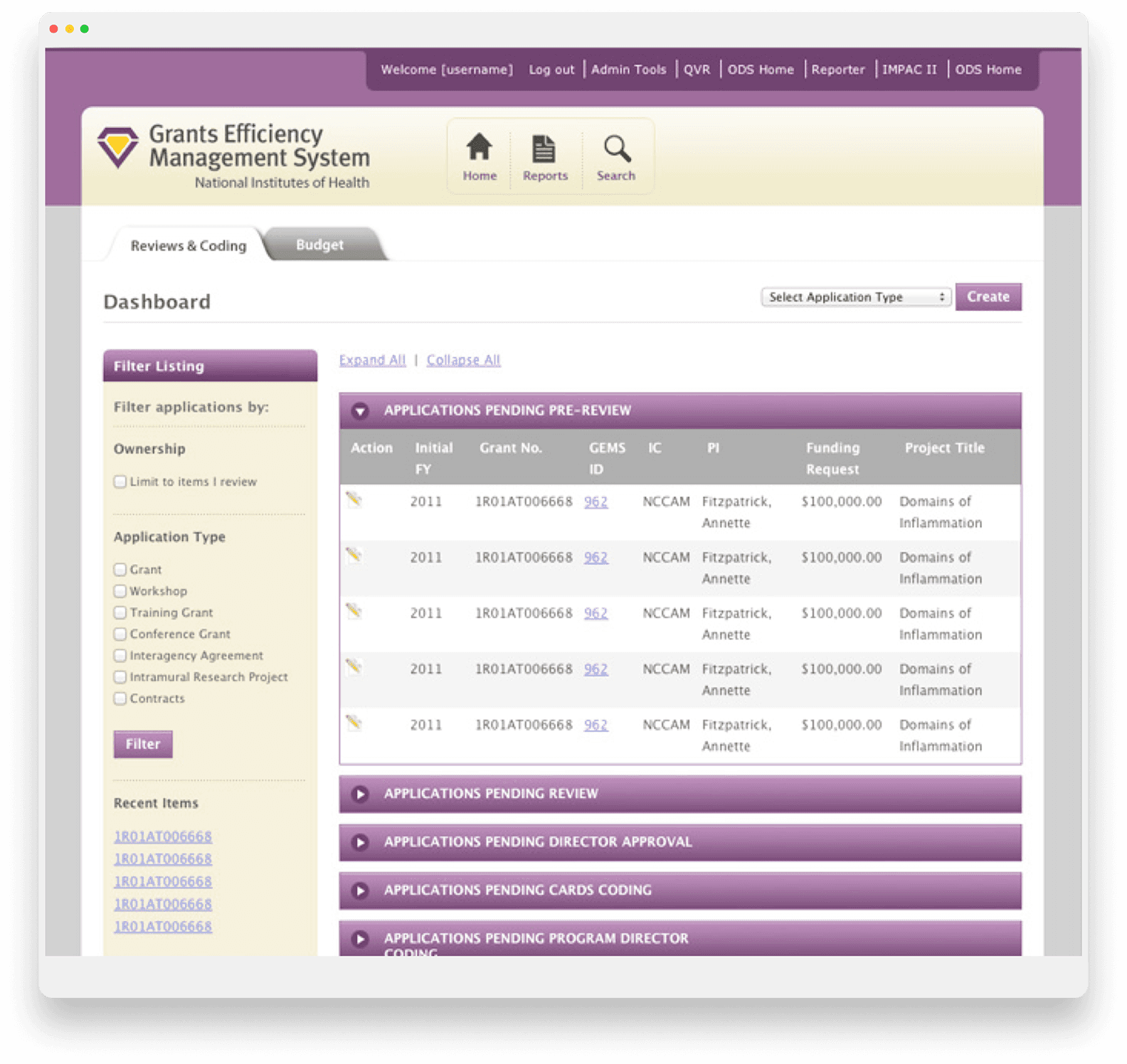
The dashboard relied on an outdated expand/collapse interface, which frustrated users due to excessive scrolling and lack of pagination.
The search function was rarely used due to poor placement and screen hierarchy.
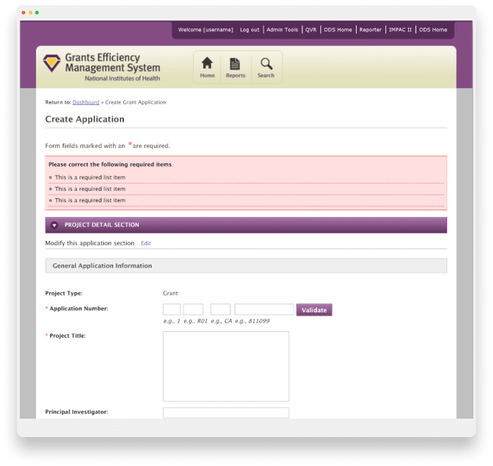
The grant review form, though functional, lacked visibility into multi-user activity and application progress.
ODS also expressed a desire to:
Adopt modern UI/UX best practices
Visualize data to enhance insight
Minimize onboarding effort and support calls
The Approach: Discovery, Iteration, and Validation
Stakeholder & User Interviews
I conducted in-depth discovery sessions with ODS stakeholders and NIH collaborators to:
Understand goals, user pain points, and workflow intricacies
Identify desired features and enhancements
These early interviews provided the foundation for information architecture and screen flow development.
Wireframing & Screen Flow Prototypes
To guide user discussions and keep the process focused:
I created high-level screen flows outlining each user journey
Developed low-fidelity wireframes to validate layout concepts and information hierarchy
These deliverables were instrumental in aligning teams on user needs, layout strategy, and content prioritization.
GEMS Dashboard Wireframe

GEMS Grant Review Wireframe

High-Fidelity Concepts & Visual Design
Once wireframes were approved, I designed high-fidelity mockups incorporating:
Streamlined dashboard navigation
Refined search/filter features
Pagination and visual feedback
Data visualization elements for better comprehension
GEMS Legacy Dashboard

Final Hi-Fidelity Dashboard Design
GEMS Legacy Grant Review Screen
Final Hi-Fidelity Grant Review Screen Design

The Outcome: A Streamlined, Insight Driven Platform
Metric
Improvement
Onboarding Time
Estimated reduction from weeks to days
Support Calls
Noticeable reduction post-launch
Reviewer Efficiency
Estimated time savings per application
Reflection
The GEMS modernization reinforced a lesson I've carried into every project since: redesigning a tool is easy; redesigning a workflow is hard. The legacy system wasn't just outdated—it was deeply embedded in how ODS staff evaluated millions of dollars in research funding each quarter. My success depended not on delivering a beautiful interface, but on understanding the rhythm of the quarterly review cycle and designing for the people who lived in it.
This project also taught me the value of visualizing the invisible. The grant review process involved multiple stakeholders, competing priorities, and a tight 90-day window. By making progress indicators, status visibility, and data insights front-and-center, I helped reviewers move from uncertainty to confidence—reducing mental friction and allowing them to focus on what mattered most: funding transformative dietary supplement research.
If I were to do this again, I would invest more heavily in early, low-fidelity prototyping with end-users. While the stakeholder interviews were invaluable, direct observation of reviewers using the legacy system would have surfaced even more granular pain points and accelerated the design phase. That said, the project succeeded because we prioritized user needs at every stage—and that foundation of trust made the final adoption seamless.